
Scatter Plot
A chart type normally used to observe and visually display the relationship between variables

Updated:
September 15, 2022A scatter plot displays the relationship between a pair of variables on a graph. A dot on a scatter plot represents one pair of variables. A pattern can be created by graphing many pairs at the same time. A relationship, or correlation, can be observed between two variables from the pattern formed.
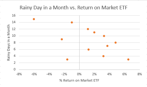
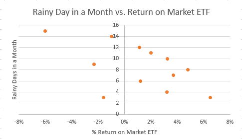
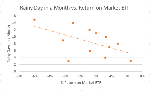
In the scatter plot pictured above, we assess the relationship between rainy days in a month and the return on a market ETF.
This article will discuss the uses and interpretation of scatter plots, issues that can arise with the interpretation or from a large data set, and how to create a scatter plot in Excel.
Scatter Plots: Uses And Interpretations

A scatter plot, or scatter chart, is generally used to assess the relationship between a pair of observations or variables. The dots on the graph are individual values, and when plotted together, a pattern is created. This pattern allows the viewer to draw conclusions based on the relationship of the variables.
These relationships can be: positive or negative, strong or weak, and linear or nonlinear. A scatter plot is also used to see the fit of the data in regression analysis.
Key takeaways of uses of a scatter plot:
- First, assess the relationship between a pair of observations.
- Assess the fit of the data in a linear or nonlinear regression.
- Finally, identify data outliers (observations that fall far away from the mean).
Interpreting Scatter Plots
As mentioned previously, the relationships of the data in a scatter plot can be: positive or negative, strong or weak, and linear or nonlinear.
This section will illustrate a positive, strong, linear relationship and a strong nonlinear relationship.

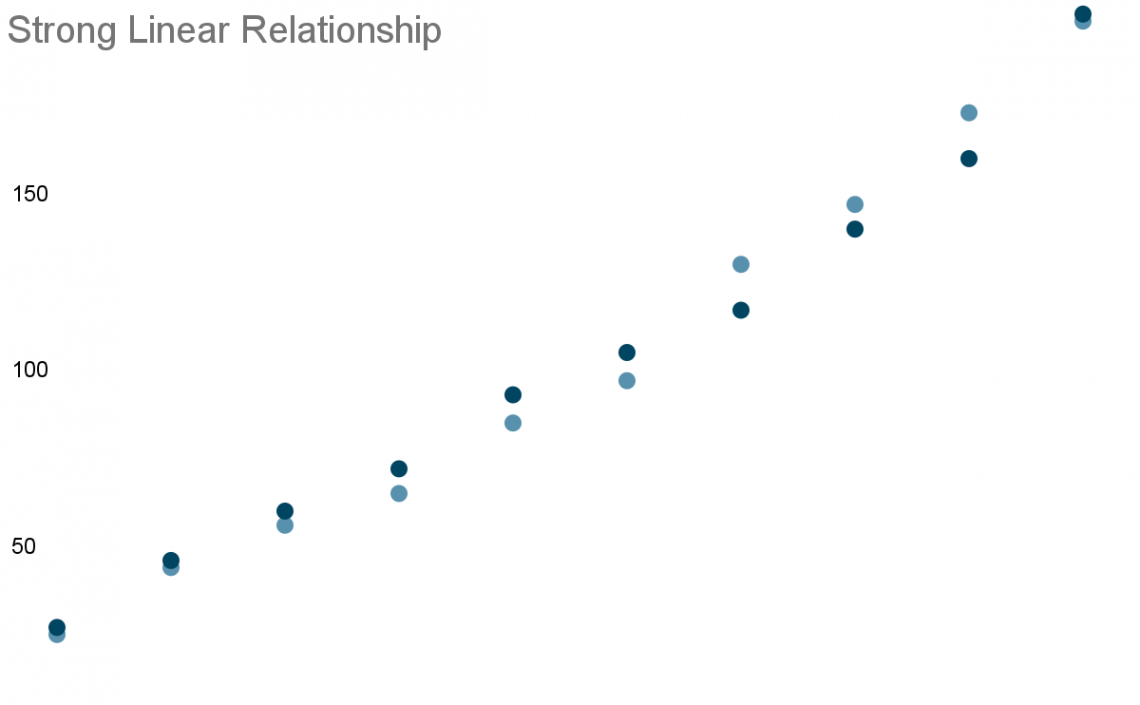
Below is an example of a scatter plot with a strong, positive, linear relationship. Notice how the data points are upward sloping, indicating a positive relationship. The data points are also very close, indicating a strong relationship. They also combine together to form a straight line, which is a linear relationship.
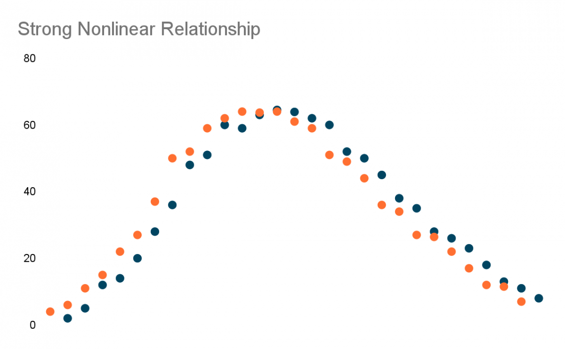
Below is an example of a scatter plot with a strong nonlinear relationship. The observations are all very close together, but they do not form a straight line. Notice how the observations peak before dropping off.
Scatter Plots: Issues And Remedies
Scatter plots can provide crucial information on the relationship of the observations in a data set. Still, two issues must be considered when interpreting the scatter plot.
The two issues are: overplotting and mistaking correlation for causation.
Overplotting
Overplotting can occur when there are too many variables to plot in a data series. This is an issue when there are too many variables, as many data points may overlap, making it difficult to see how packed the data points are in a small area on the chart.
One remedy to prevent overplotting is to take a random sample of the large data set. By randomly taking a sample of the data points, the viewer can obtain a good idea of the relationship that exists in the entire data set.
Correlation Does Not Imply Causation
One of the main issues of scatter plots isn't plotting the data itself, but its interpretation. It is a common mistake to interpret a positive or negative correlation and assume causation. But it is important to remember that correlation does not imply causation.
Correlation does not imply causation means that although there may be a relationship between two variables, changes in one variable doesn't mean the other variable will change by the same amount, if at all.
WSO Real World Example:
It would be incorrect to view statistics on the number of car accidents and birds in Los Angeles and assume that one causes another, even if there is a positive relationship when the data set is plotted in a scatter plot. There are undoubtedly other factors at play regarding car accidents and an increasing or decreasing bird population.
One remedy is to be aware that the change in one variable may not lead to a change in the other variable, which would mean a correlation may not actually exist between the variables. If a positive or negative relationship exists, further analysis should be conducted before reaching a conclusion.

Creating A Scatter Plot In Excel
Now we will go over how to create a scatter plot in Excel.
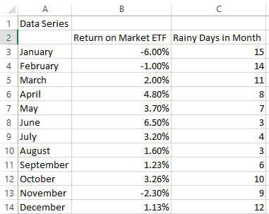
First, we must gather data for our data series and enter or import the data into Excel. For example, below, we have data on the return on a market ETF and the number of rainy days in a given year.
Now that we have our data in Excel, we can follow the steps below to plot the data series on a scatter chart.
- Highlight the data series to plot and click on the "Insert" tab in the Excel ribbon.
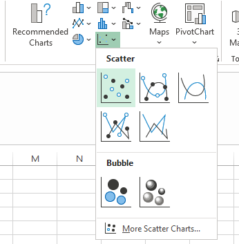
- In the "Charts" area, click the dropdown with the scatter plot (highlighted in the image below).
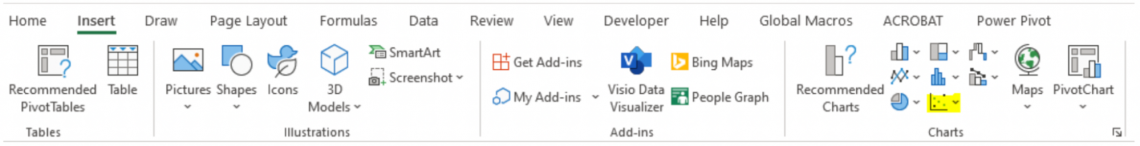
- Select "Scatter" to create a scatter plot of the data.
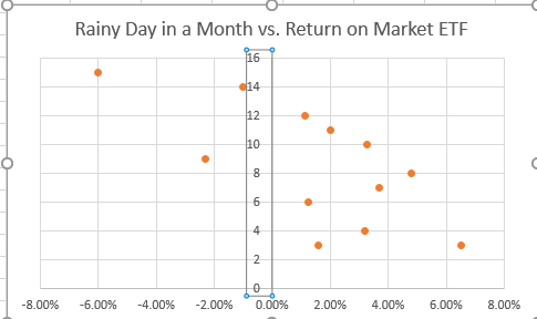
- Now that the scatter plot is created, we may need to update the formatting of our graph. Notice how the number of rainy days in a month (vertical axis) is at the center of the chart below.
- To move the vertical axis to the left side:
- Then, click on the vertical axis in the scatter plot.
- Then, click on the vertical axis in the scatter plot.
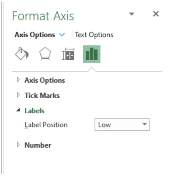
- On the right-hand side of Excel, click the bar chart (pictured below)
- Click "Labels"
- Change "Label Position" to "Low"
- The updated scatter plot with the vertical axis on the left is pictured below.

Scatter Plots And Linear Regression
One common addition to a scatter plot is a trendline for regression analysis. By adding a trendline, we can see the best fit of the data series. Best fit can tell us how strong the relationships are between observations.
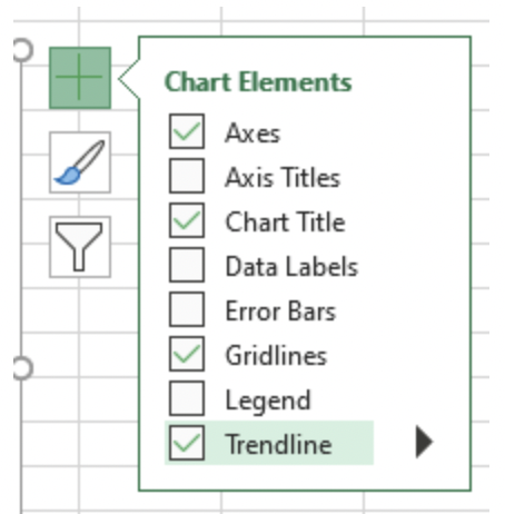
To add a trendline in Excel:
- First, click on the scatter plot.
- Next, click the plus sign on the upper right corner of the chart.
- Select "Trendline."
Below is the scatter plot of rainy days in a month versus the return on a market ETF, with a trendline added to it.

Sign Up for our Free Excel Modeling Crash Course
Begin your journey into Excel modeling with our free Excel Modeling Crash Course.
More on Excel
To continue your journey towards becoming an Excel wizard, check out these additional helpful WSO resources.

or Want to Sign up with your social account?